ROLE:

UI/UX Designer

PROJECT TYPE:

UI/UX

SCOPE:

6 weeks

DELIVERABLE:

Website

Tools: Figma, Figjam Zoom and

Google Docs

rEVALIDA PRO

Redisign landing page and course platform

Proyect Goal


Legal courses platform that allows through different exercises and study techniques, review to pass the General Revalidation Exam of Puerto Rico.

Problem


The General Revalidation Examination evaluates the capacity of the aspiring lawyer to analyze legal problems and to measure the minimum skills and knowledge for the practice of law in Puerto Rico. This exam requires extensive preparation and is only administered twice a year.

On the other hand, the Revalida Pro platform that was created for the review of this test has the following problems:


-The platform was created years ago by a single programmer.

-Poor UI/UX experience

-The users have poor references to the platform because of the visual aspect.

-The number of users has decreased a lot.

Proyect Goal


Due to the decrease of users and bad references we will use feeedback to create a platform that will allow students to review the 13 subjects of content required for the exam as well as provide a modern and user friendly design.

Design Process

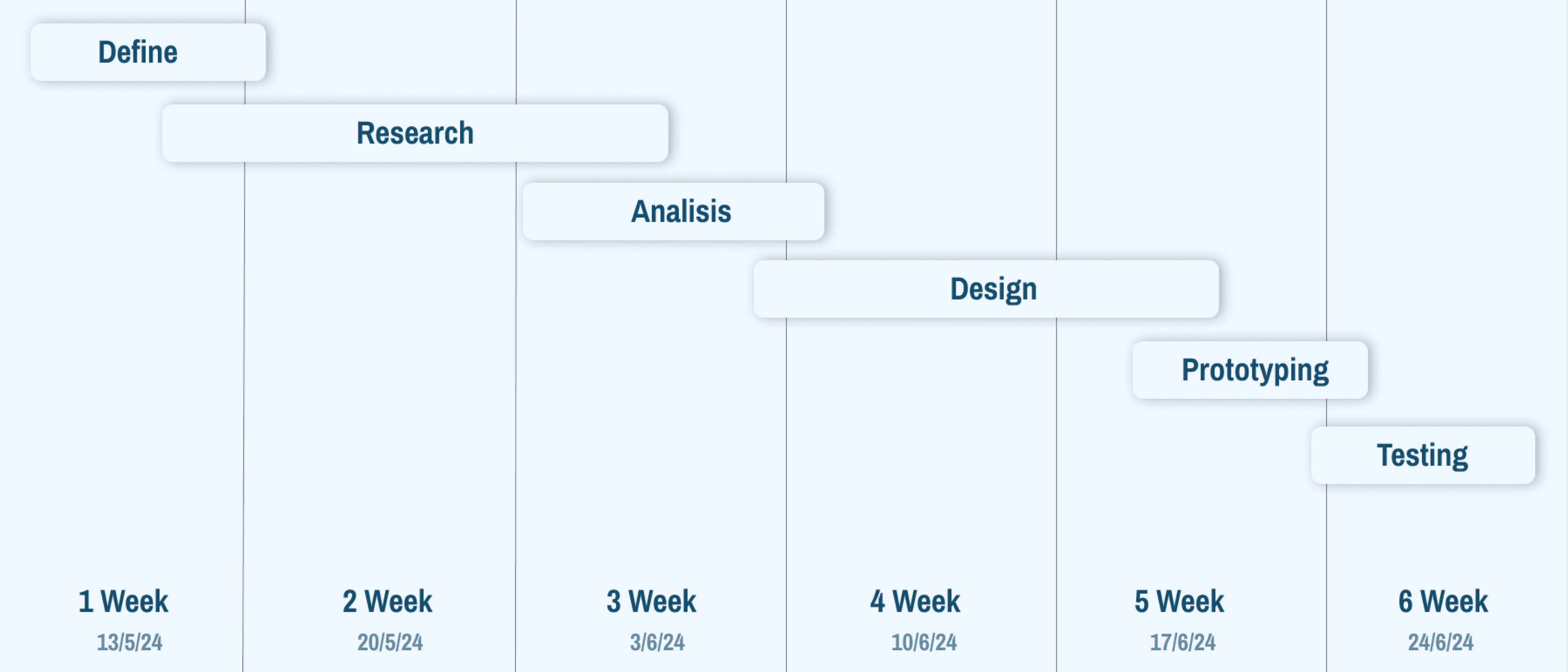
The work methodology was Sprint, in which specific objectives had to be achieved every week. It was really interesting to work in this way together with the development team.

Objectives


Redesign the course platform and make it visually modern and user friendly.

Improve the user flow of the current platform in the course portal.

Create a lead converter landing page

Sections required

-Landing page

-Course panel

-Shopping cart with check out

-User courses

-Course with study material

-Flashcards panel

-Multiple selection panel

-Course material panel

-Outline panel

-Purchase history

-Course progress

Interview


Why do you need a guided study plan?

Do you study from physical books or online bibliographies?

How do you organize your study time?

What do you think of online study platforms?

What do you like and dislike about the RevalidaPro platform?

Do you find the RevalidaPro platform easy to use?

What would you like to add to the RevalidaPro platform?

What functions do you consider important in a study platform like this?

Have you had experience with other platforms? If so, please tell us about your experience.

Do you consider that the information provided by the platform is adequate for the exam?

Do you have a problem not covered by the current platform?

Insigths


-Students require a guided study plan due to the large amount of content to be studied, and they say they do not know where to start.

-Most students study in the morning because they are more productive.

-They prefer to study online because they find it easier and faster to study from their laptop.

-They consider the flashcard, multiple choice and test sections to be very important, as this is where they interact the most.

-The platform is poor in accessibility because the landing page is not eye-catching and is quite disorganized especially in the area of membership plans.

-They report that some buttons are not obvious and are difficult to understand.

-The space allocations are poorly established

-They reported problems when logging in.

-Most of the students have not been on other study platforms because of the high cost of membership.

-They like the content provided, it needs to be visually pleasing.

-the majority of users agree that the platform is visually poor.

User Persona


The data obtained from the interview participants and their insights were taken into account for the creation of these user personas.

Empathy Map


This was the result of the insigth found in the interview conducted with users

Original Landing Page


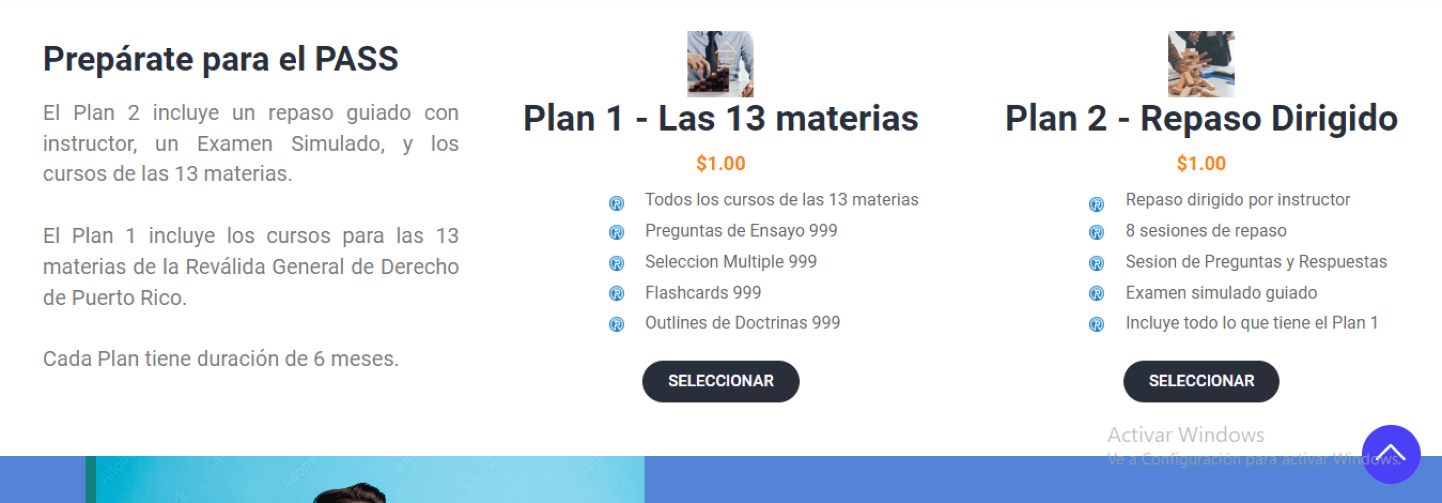
The first challenge with this project was to make a landing page converter of leads, since the original was disorganized and visually unpleasant, which caused little retention and reliability to the main product that is the study platform. We sought to restructure it and change typography, images and content.

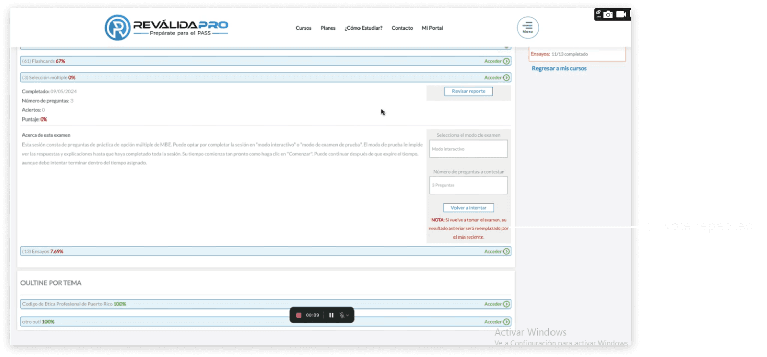
Original course panel


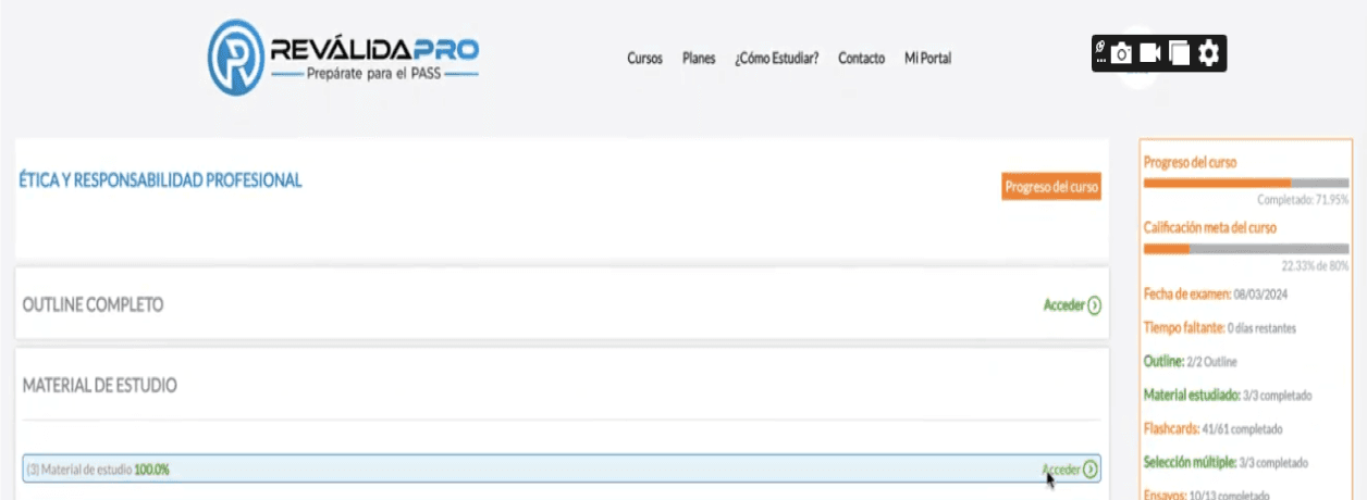
To show the redesign of the RevalidaPro platform it was first necessary to find the main problems in each section of this platform, visualized by the students of the course as well as by me.

Individual Course Panel

Original courses panel


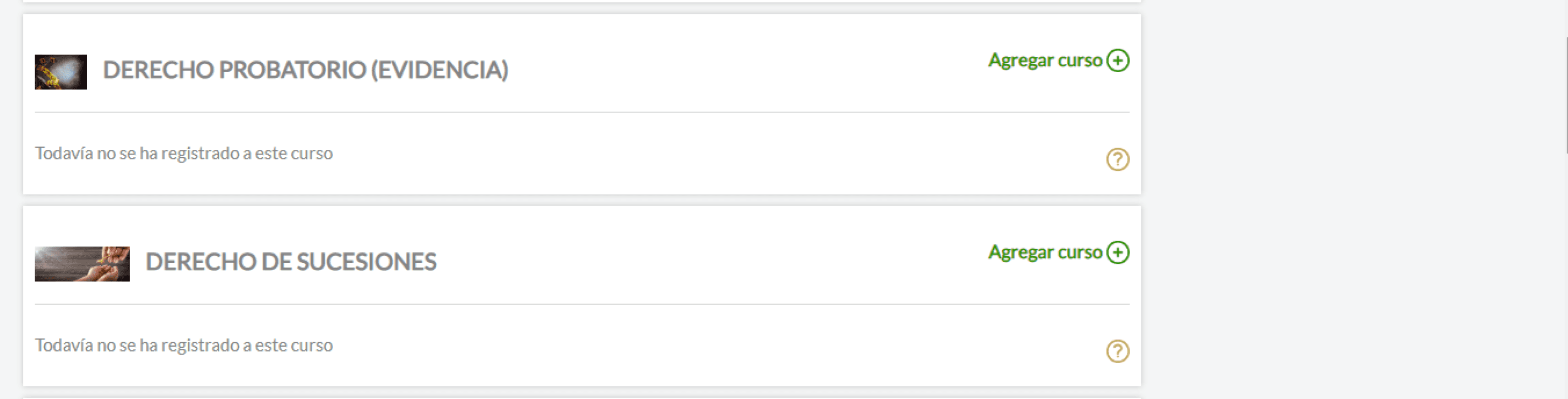
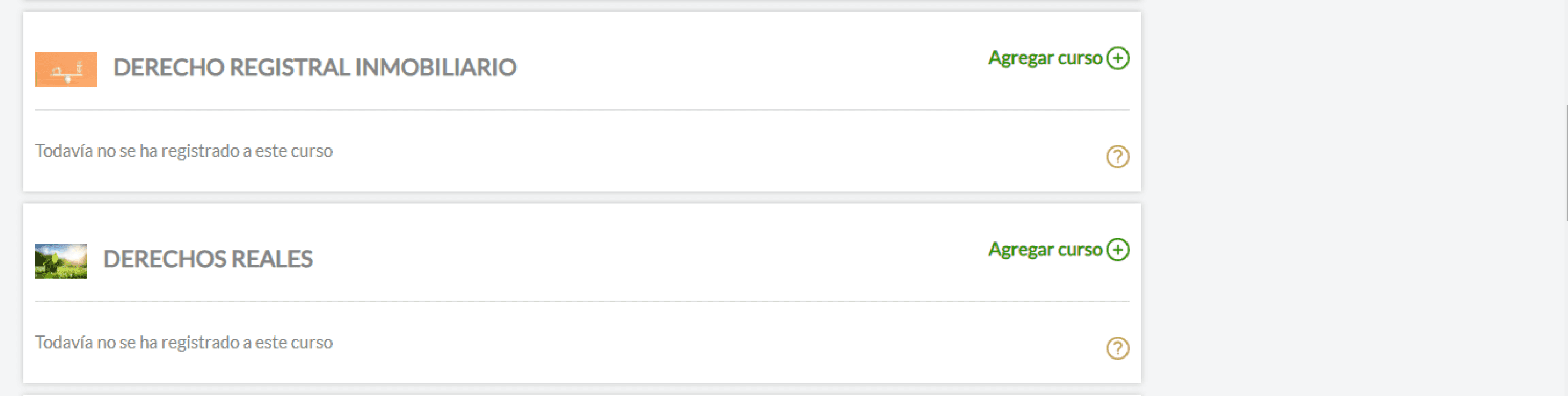
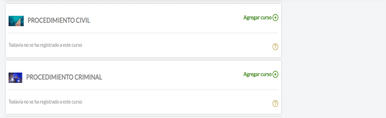
We can see that the structure and positioning of the images is not proportional, also the price of each course is incorrect and the call to action is not visible as a button.

Individual Course Panel- Essay section

Course - Essay question

Course -Essay Question Result

Course -Multiple Choice Question Section

Course -Multiple Choice Question

Course -Multipole Choice Question Results

Course -Flashcards Question Section

Course -Flashcards Question

Course -Flashcards Question

Course -Flashcards Question Results

Main problems encountered

Information Architecture

-Poor detail quality

-Small print

-Unnoticeable buttons

-Disorganized and not very logical structure

-Lack of modernism

-Hidden feedback sending button

-Repetitive messages in the drop-down menus

-Self-assessment system in test section ambiguous

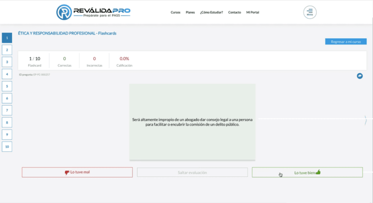
-Ambiguous flashcard rating system

-Opciones iguales duplicadas

-Small dimensions of boxes

Sketches

Low fidelity

Original courses panel


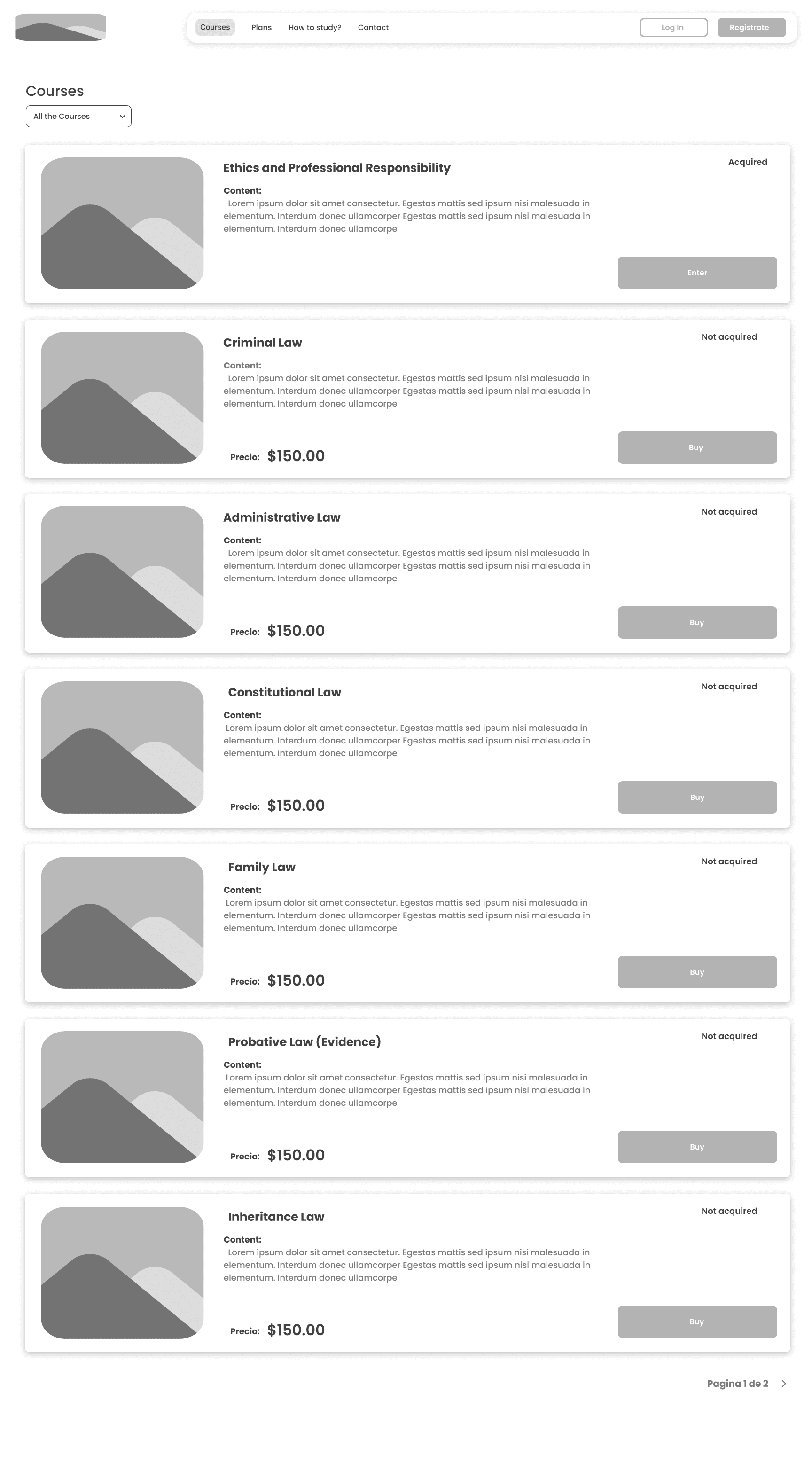
Redisign Landing Page

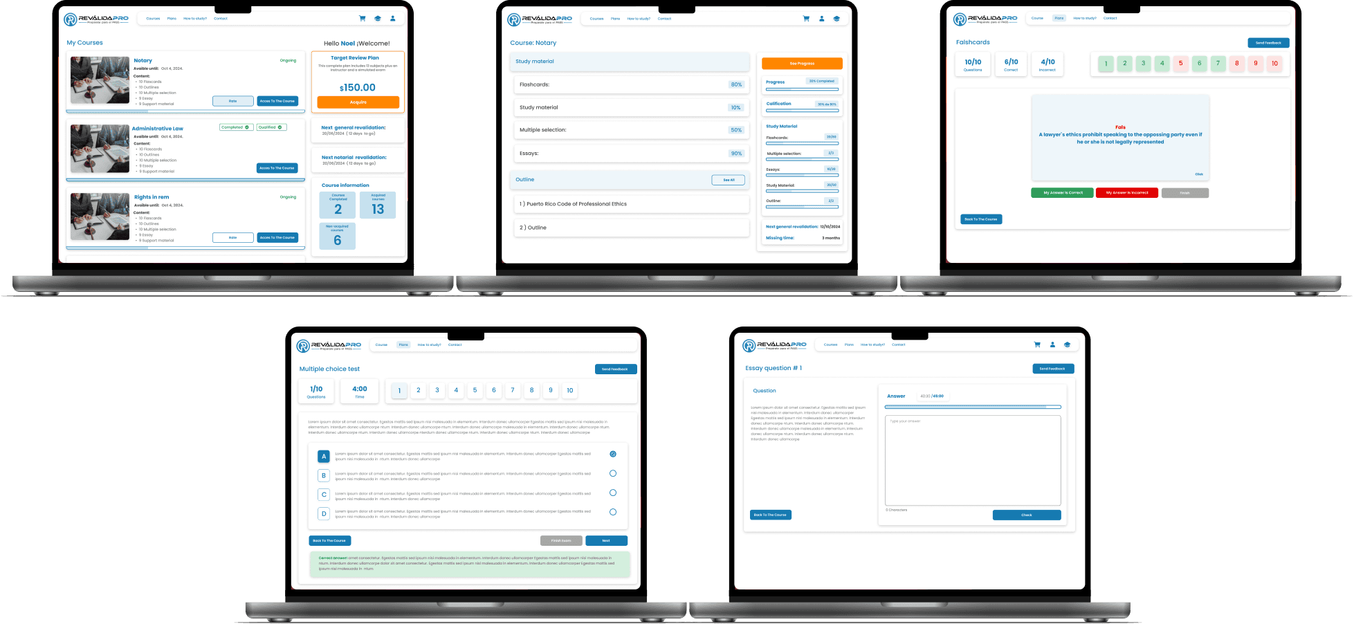
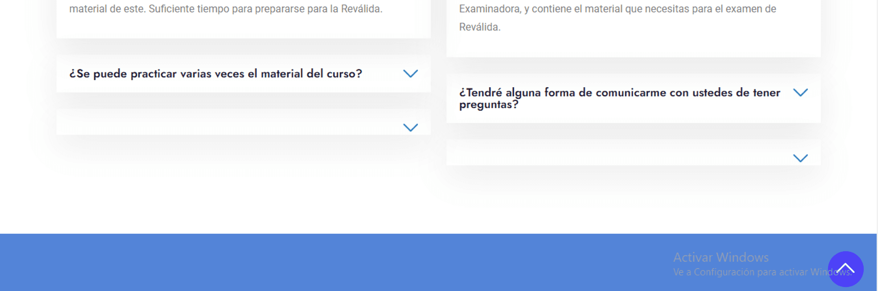
The landing page was redesigned to be bold and eye-catching to encourage the student to purchase the study plan.In addition, the informative sections of the purchase plans were restructured and the contact section was modernized along with the FAQ section, giving it an agile and pleasant look.

Redisign courses panel

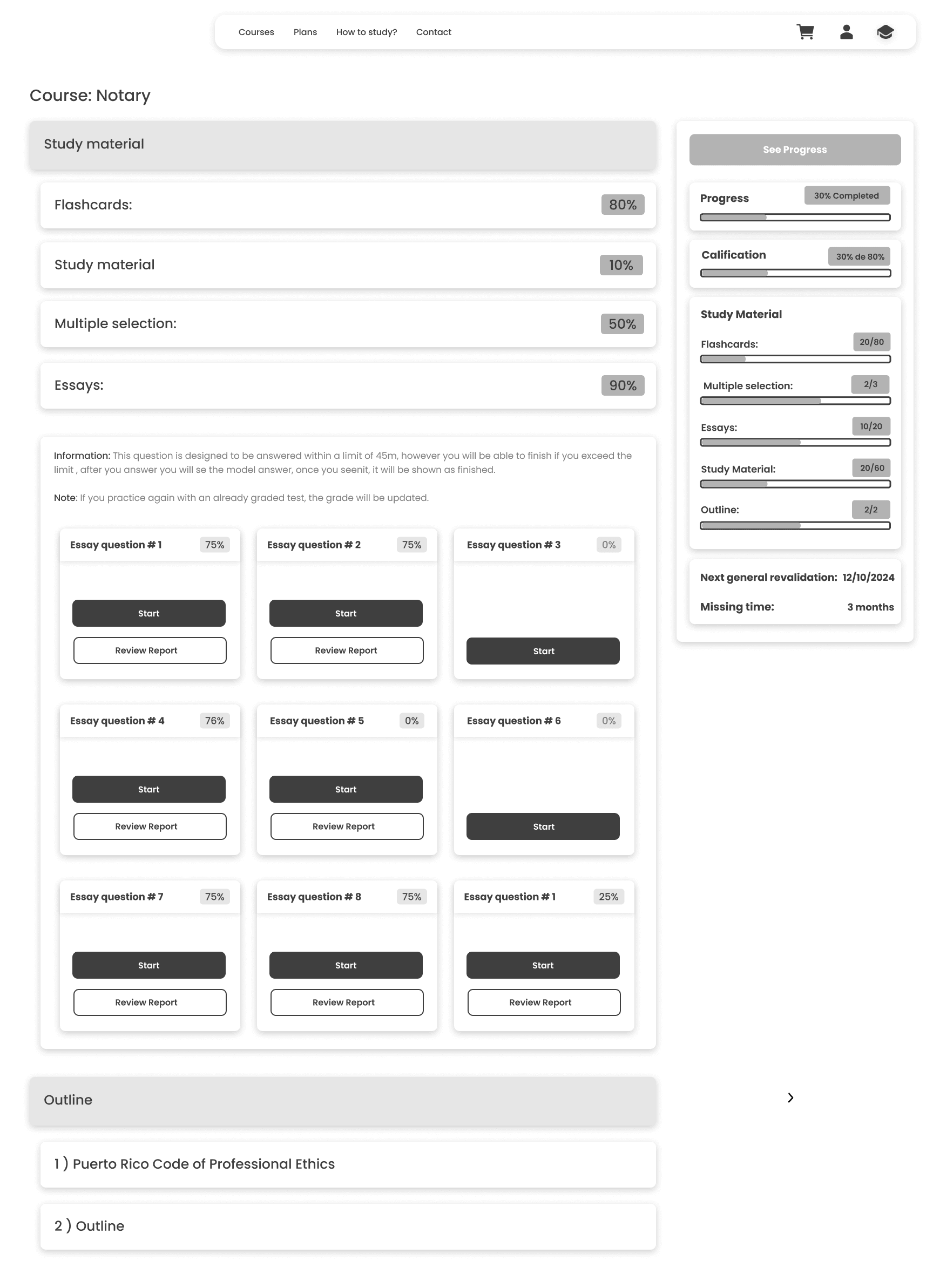
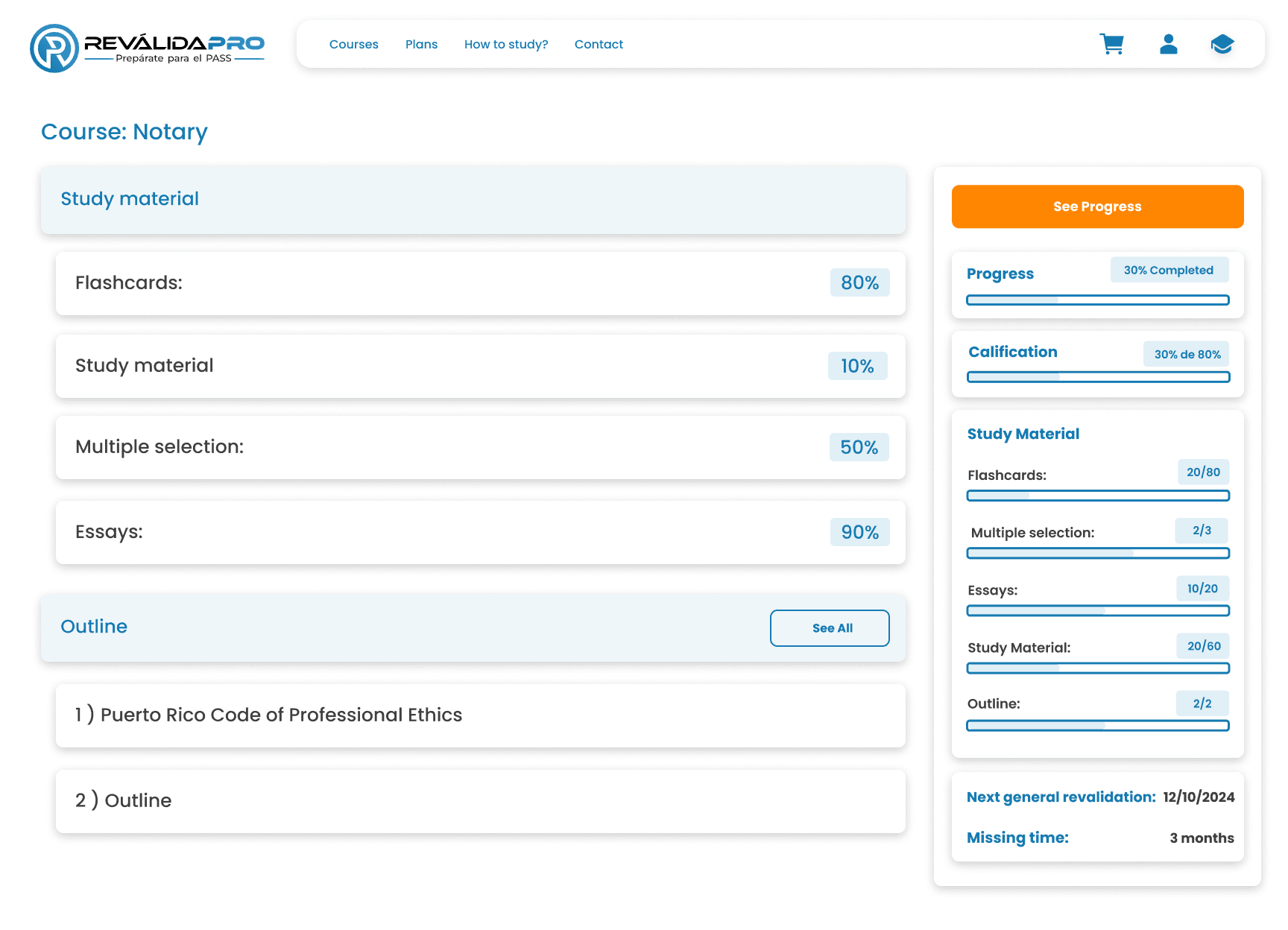
Redisign course panel

Redisign course panel- Essays section

Essay question

Essay Question Result

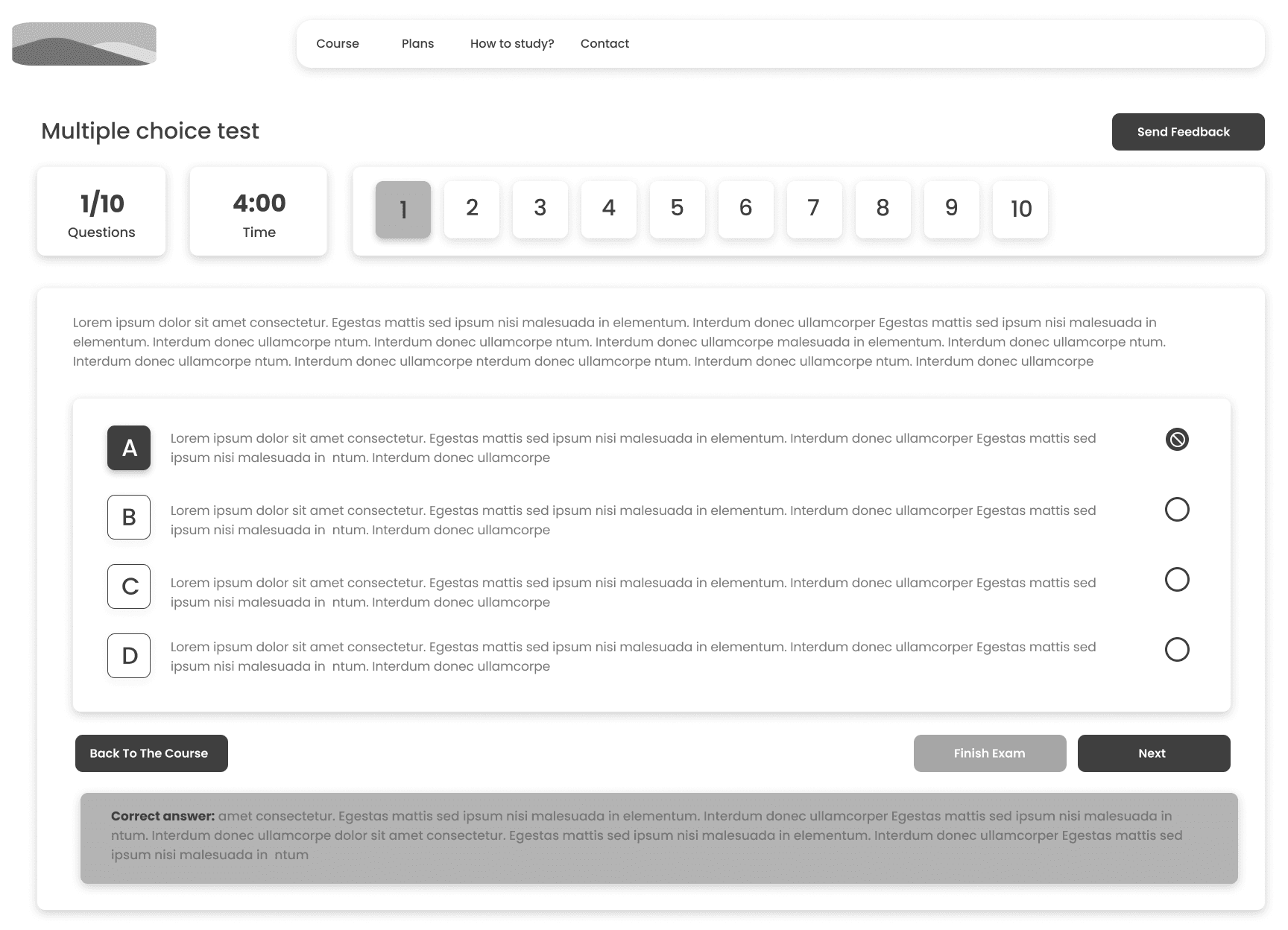
Multiple Choice Question Section

Multiple Choice Question

Multipole Choice Question Results

Flashcards Question Section

Flashcards Question

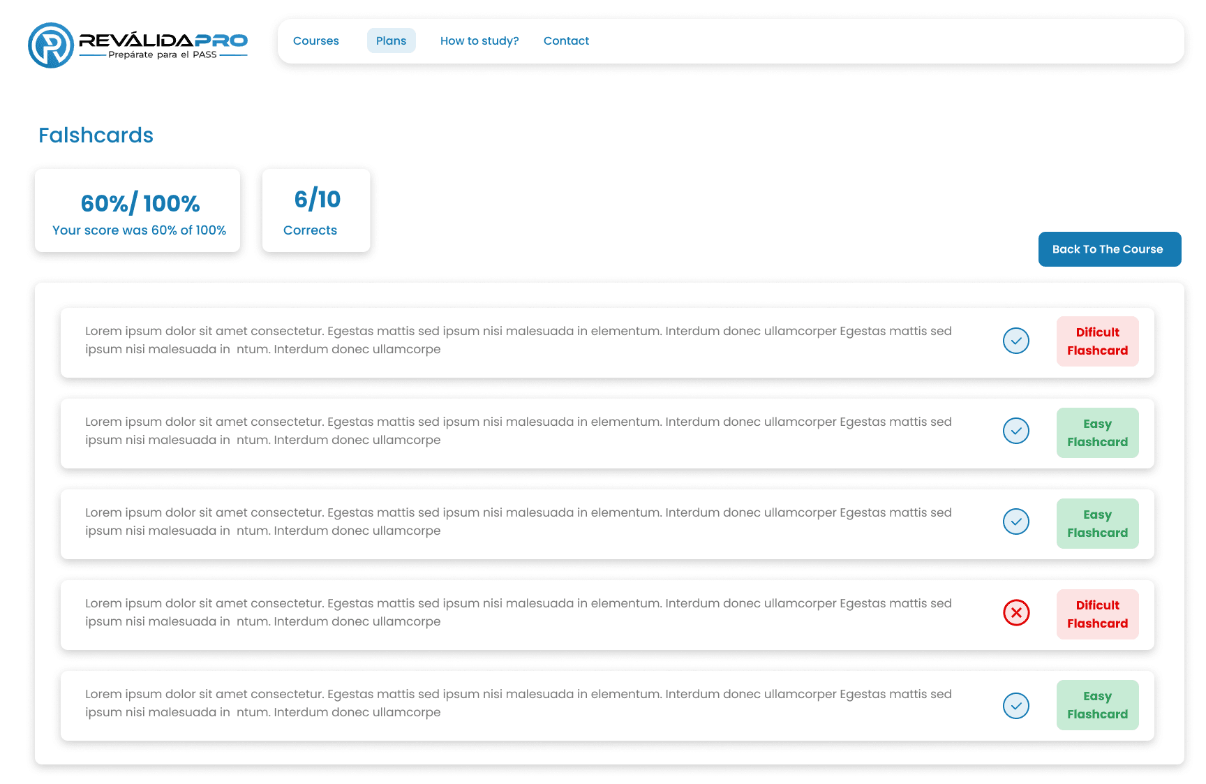
Flashcards Question Results

User testing

10 participants were recruited through social media to conduct a remote usability test with the purpose of finding possible design improvements, most of the participants understood how to use the platform and 80% enjoyed using the platform and expressed that they would continue to use it.

Task

-1) Open the test tab and start an activity.

-2) Select the flashcards section and add the flashcards you wish to complete to get started.

-3) Open the multiple choice tab and review the previous report.

4)Go to the content material in the audio-visual section and then go back to it

-5) Go to the Outline section and search in the search engine for the word “Case Processing”.

-6) Go to the report at the end of the assignment in the multiple choice section.

-7)Send feedback when you enter flashcard and multiple selection

Post Test Questions

What was your favorite part of this platform?

If you found any part difficult, tell me which part and which part?

Would you continue to use this product?

Would you recommend this product to your colleagues?

Results

80% of the participants enjoyed this particular experience and would continue to use this product.

60% of the participants were able to complete all the tasks successfully.

20% of the participants were unable to complete the tasks and complained about the experience.

What I learn

Design system

I learned to focus on the real needs of the user. It taught me to ask the right questions at the right time. I grew more as a designer through the remodeling that was done in this project covering the main problems found in the whole platform.

Comments


positive

“I like the simplicity of the course i was able to focus on what im doing”.

“I love the visual enhancement that was made to the website it looks modern and clean”.

“I love that I can self-evaluate with the platform.


Negative

“The colors of the buttons on the flashcard do not match the general aesthetics.

“I find it difficult to identify the button that says “important information such as previous revalidations”.

Suggestions

“I would like the outlines section to be called differently since I can't identify the name at the beginning”.

“The percentage section would be better to add it only in the box and not in each dropdown”.

“Add another label for the button in the outlines section that shows the previous revalidations”.

“Change colors of buttons in flashcards”

Participation Profile

The population of 10 participants consists of young adults between the ages of 20 and 32, with a higher percentage of women than men, and the participants are from law schools.


ROLE:

UI/UX Designer

PROJECT TYPE:

UI/UX

SCOPE:

6 weeks

DELIVERABLE:

Website

Tools: Figma, Figjam Zoom and

Google Docs

Proyect Goal:

Legal courses platform that allows through different exercises and study techniques, review to pass the General Revalidation Exam of Puerto Rico.

Problem:

The General Revalidation Examination evaluates the capacity of the aspiring lawyer to analyze legal problems and to measure the minimum skills and knowledge for the practice of law in Puerto Rico. This exam requires extensive preparation and is only administered twice a year.

On the other hand, the Revalida Pro platform that was created for the review of this test has the following problems:


-The platform was created years ago by a single programmer.

-Poor UI/UX experience

-The users have poor references to the platform because of the visual aspect.

-The number of users has decreased a lot.

Solution:

Due to the decrease of users and bad references we will use feeedback to create a platform that will allow students to review the 13 subjects of content required for the exam as well as provide a modern and user friendly design.

Design process:

The work methodology was Sprint, in which specific objectives had to be achieved every week. It was really interesting to work in this way together with the development team.

Sections required


-Landing page

-Course panel

-Shopping cart with check out

-User courses

-Course with study material

-Flashcards panel

-Multiple selection panel

-Course material panel

-Outline panel

-Purchase history

-Course progress

Interview:


1) Why do you need a guided study plan?

Do you study from physical books or online bibliographies?


2) How do you organize your study time?


3) What do you think of online study platforms?


4) What do you like and dislike about the RevalidaPro platform?


5) Do you find the RevalidaPro platform easy to use?


6) What would you like to add to the RevalidaPro platform?


7) What functions do you consider important in a study platform like this?


8) Have you had experience with other platforms? If so, please tell us about your experience.


9) Do you consider that the information provided by the platform is adequate for the exam?


10) Do you have a problem not covered by the current platform?

Insights:


-Students require a guided study plan due to the large amount of content to be studied, and they say they do not know where to start.


-Most students study in the morning because they are more productive.


-They prefer to study online because they find it easier and faster to study from their laptop.


-They consider the flashcard, multiple choice and test sections to be very important, as this is where they interact the most.


-The platform is poor in accessibility because the landing page is not eye-catching and is quite disorganized especially in the area of membership plans.


-They report that some buttons are not obvious and are difficult to understand.


-The space allocations are poorly established


-They reported problems when logging in.


-Most of the students have not been on other study platforms because of the high cost of membership.


-They like the content provided, it needs to be visually pleasing.


-the majority of users agree that the platform is visually poor.

Name: María Torres is a passionate 26-year-old law student living in San Juan, Puerto Rico. She studied at the University of Puerto Rico. Currently, she works as an intern at a law firm, where she has gained experience in civil and criminal law. With the general revalidation exam in sight, she is overwhelmed .

Needs: Pass the Revalida General de Puerto Rico exam on the first attempt.

Motivations:

  • -Obtaining a license to practice law

  • -Desire to contribute to social justice and help communities

  • -Overcoming family and personal pressures to succeed

Challenges and Frustrations:

-Managing overwhelm from the amount of content you need to study.

  • -Managing time between work, study, and personal responsibilities

Behavior and habits

  • -Uses his phone and laptop to study as well as access online resources.

  • -Participates in face-to-face and virtual study groups

  • -Uses time management applications

Reason for Purchase

  • -Find a guided review that offers a structured approach and resources specific to the revalidation exam.

  • -Evaluate recommendations from other students and testimonials about the effectiveness of the platform.

  • -Affordable prices and payment options

  • -Up-to-date content aligned to the exam

  • -Access to supplementary material and mock exams

User persona

The data obtained from the interview participants and their insights were taken into account for the creation of these user personas.

Name: Carla Flores

Age: 26 years old

Gender: Female

Location: San Juan

Edication level: Bachelor`s degree in Law

Marital status: Singles

Name: María Torres is a passionate 26-year-old law student living in San Juan, Puerto Rico. Since she was a child, she has always felt a strong desire to help others, which led her to study law at the University of Puerto Rico. Currently, she works as an intern at a law firm, where she has gained experience in civil and criminal law. With the general revalidation exam in sight, she is overwhelmed as she knows this is a crucial step towards becoming a licensed attorney, and fulfilling her dream of working in litigation. However, the amount of material she needs to study and the pressure to obtain good results makes her anxious and distressed.

Name: Needs Pass the Revalida General de Puerto Rico exam on the first attempt.

Motivations:

  • -Obtaining a license to practice law

  • -Desire to contribute to social justice and help communities

  • -Overcoming family and personal pressures to succeed

Challenges and Frustrations:

-Managing overwhelm from the amount of content you need to study.

  • -Managing time between work, study, and personal responsibilities

Behavior and habits

  • -Uses his phone and laptop to study as well as access online resources.

  • -Participates in face-to-face and virtual study groups

  • -Uses time management applications

Reason for Purchase

  • -Find a guided review that offers a structured approach and resources specific to the revalidation exam.

  • -Evaluate recommendations from other students and testimonials about the effectiveness of the platform.

  • -Affordable prices and payment options

  • -Up-to-date content aligned to the exam

  • -Access to supplementary material and mock exams

Says and Do?

  • Participate in study groups and online forums to share resources.

  • Search for study recommendations and platforms

  • Discuss your test expectations with family and friends

  • she talks about her progress in studying.

See?

  • See on their networks tips for passing the exam and advice from other students.

  • View platform announcements to review content

  • She sees students accessing platforms with an out-of-budget membership.

  • Colleagues preparing well in advance

Hear?

  • Hear tips from teachers on how to study effectively

  • Listening on Strategies applied by alumni

  • Comments on the difficulty of the test and the importance of good preparation

  • Listens to comments from peers about not finding suitable material that suits their learning style

Think and Feel?

  • she feels anxious about the exam

  • she wants to pass the exam on the first try

  • She is afraid that she is not sufficiently prepared.

  • She feels that the exam is a key challenge to achieve the professional life she desires.

Empathy map

This was the result of the insigth found in the interview conducted with users

Original Landing page :


The first challenge with this project was to make a landing page converter of leads, since the original was disorganized and visually unpleasant, which caused little retention and reliability to the main product that is the study platform. We sought to restructure it and change typography, images and content.

Main problems

  • No image or main text to inform the main concept of the page

  • Direct introduction to the price ,visual disorganization in the plans.

  • Call to action not visible

  • Very large boxes

Original course panel:


We can see that the structure and positioning of the images is not proportional, also the price of each course is incorrect and the call to action is not visible as a button.

Main problems

  • Links in the login area

  • Small and not visible images

  • Call to action should be bigger

Main problems

  • Links in the login area

  • Small and not visible images

  • Call to action should be bigger

Individual course panel:


Main problems

  • Not good use of screen space

  • Repetitive message in each section

  • The option to start again is displayed even if the test has not been started before

Individual course panel ( essay section)


Individual course panel ( essay results)


Main problems

  • Small non-obvious feedback button

  • Hide question numbers

  • To check the answers the button is not noticeable

Course section (Multiple choice questions)


Main problems

  • imprecise rating scale

Main problems

  • No image or main text to inform the main concept of the page

  • Direct introduction to the price ,visual disorganization in the plans.

  • Call to action not visible

  • Very large boxes

Main problems

  • Buttons too big

  • Invisible font

  • Wrong layout

Empathy map

This was the result of the insigth found in the interview conducted with users

Main problems

  • Inadequate and confusing approval range

Course ( Flashcards question)


Course ( Flashcards answer result)


Main problems encountered


-Poor detail quality

-Small print

-Unnoticeable buttons

-Disorganized and not very logical structure

-Lack of modernism

-Hidden feedback sending button

-Repetitive messages in the drop-down menus

-Self-assessment system in test section ambiguous

-Ambiguous flashcard rating system

-Opciones iguales duplicadas

-Small dimensions of boxes

Course ( Flashcards question)


Information architecture


Mid-fidelity


Sketches


Original courses panel


The landing page was redesigned to be bold and eye-catching to encourage the student to purchase the study plan.In addition, the informative sections of the purchase plans were restructured and the contact section was modernized along with the FAQ section, giving it an agile and pleasant look.

Redisign Landing Page


Redisign courses panel


Redisign course panel


Redisign course panel- Essays section


Flashcards Question Results


Flashcards Question


Flashcards Question Section


Multipole Choice Question Results


Objetives:

Redesign the course platform and make it visually modern and user friendly.

Improve the user flow of the current platform in the course portal.

Create a lead converter landing page

Create a free website with Framer, the website builder loved by startups, designers and agencies.